How to Gain Lead Flow Insights with a Sankey Diagram

The Importance of Data Visualization in Marketing
In modern marketing we generate significant amounts of commercial data, yet especially in life sciences marketing we often suffer from insight scarcity. The role of a marketing leader is not just to generate leads, but align with the commercial organization, understand how marketing is working, and engineer a consistent revenue engine. To do this, effectively visualizing your data in order to create actionable insights is critical.
Just as a scientist visualizes experimental results to make hypotheses and plan next steps, a marketing leader must visualize the "Commercial Physiology" of their organization. Effective visualization can help diagnose friction points, calibrate budget allocation, and validate the return on investment for complex, multi-channel strategies.
Standard vs. Complex Charts and Diagrams
Most marketing dashboards rely on a standard set of static visuals: bar charts for volume, line graphs for trends, and basic funnel diagrams for conversion rates and movement from one stage of engagement to the next. While these are useful for isolating specific metrics (e.g., "How many MQLs did we generate last month?"), they fail to capture the fluidity and interconnectivity of a more complex marketing organization - especially where multiple touchpoints or sales team layers exist. A linear funnel assumes a single path to purchase, but the reality of life science procurement is non-linear and complex. To map this reality and provide deeper insights into commercial lead and opportunity flow, a Sankey diagram can be highly useful.
What is a Sankey Diagram and Why is it Useful for Marketers?

A Sankey diagram is a specific type of flow diagram where the width of the arrows is proportional to the flow quantity. For marketers, it's a highly useful tool for visualizing how leads move through your entire commercial system.
Unlike a basic funnel, a Sankey diagram provides a high-fidelity view of:
- Volume Source: Exactly how many leads are coming from each specific channel (e.g., Webinars vs. paid search vs. ABM) and where those leads enter the funnel.
- Systemic Movement: How those leads traverse—or fail to traverse—the commercial stages.
- Data Hygiene Gaps: Perhaps most importantly, the process of constructing a Sankey diagram acts as a stress test for your data. If you try, but can't construct a Sankey that connects a lead source all the way to a closed-won deal, you've now identified gaps in your tracking infrastructure and you will struggle to report on ROI from your marketing efforts.
How to Create a Marketing Sankey
Creating a Sankey diagram is as much a process of "Data Harmonization" as it is design.
- Step 1 - Select Your Tool: Identify the tools you will use. There are many dedicated Sankey web sites likes sankeyart.com or SankeyMATIC.com, and there are even Excel plugins to allow you to create a Sankey directly from your Excel data. We prefer SankeyMATIC for its combination of ease of use, flexibility, and price (free!)
- Step 2 - Data Gathering: You must list out every lead source and define your funnel stages (i.e. MQL, SQL, SAL, Opportunity, etc.) Consistency in naming conventions is critical here to ensure the data flows logically.
- Step 3 - Define How Leads Flow: Not all leads behave the same. Some leads flow from one stage to the next, some leads may move directly to BD. Some leads may enter the funnel as MQLs; some may enter and immediately be triaged as SQLs. You must map the logic: do "hot" leads go directly to Sales? Do "warm" leads go to Nurture? This triage logic must be explicitly defined in your data set.
- Step 4 - "Dummy Data" As Needed: If your current CRM data is messy, or if you can’t perfectly map out all of these steps, keep going! It is a highly valuable exercise to create "dummy data" to map out what your ideal process should look like. This allows you to visualize the "Theoretical Funnel" and identify exactly where your real-world data is failing to match the model, and can help you figure out how to build in systems to allow you to better fully track your leads and funnel.
Case Study: Creating a Sankey for a Multi-Channel Life Science Engine
For an example of how to create a Sankey, let’s look at a hypothetical case study of a mid-sized life science organization:
Commercial Structure
The organization consists of three distinct commercial units: a Marketing Team generating inbound interest and nurturing leads, a Sales Development (SDR) team performing outreach to generate warm leads, and also turning marketing leads into meetings, and a Business Development (BD) team closing deals while also sourcing some of their own deals.
Data Inputs
We will utilize the following data set to construct our "Commercial Flow." Note how we track multiple distinct channels for lead generation:
Top of Funnel (MQL Sources):
- Conferences (2000)
- Webinars (1000)
- Account-Based Marketing (2500)
- Gated Content (400)
Mid-Funnel (Qualification):
- The SDR team sources 1000 leads directly.
- MQLs are triaged: 1000 move to SQL status, while the remainder are automatically routed to a Nurture phase.
Bottom Funnel (Conversion):
- SQLs convert to Meetings/SAL (Sales Accepted Leads). Those that do not convert return to Nurture.
- We also track "Direct-to-Meeting" sources, including high-intent SEO traffic (200), Paid Search (100), and leads sourced directly by the BD team (50).
Revenue Realization: We track the flow from Meetings (200) to Opportunities and finally to 75 Won Business deals.
Input Code
Based on the data inputs above, we can create a code block showing lead sources and destinations in the format of 'Source [number of leads] Destination Stage'. Here is the code based on the data inputs above:
// Top of Funnel Inputs
Conferences [2000] MQL
Webinars [1000] MQL
ABM [2500] MQL
Gated Content [400] MQL

// Mid-Funnel Triage
SDR Team [1000] SQL
MQL [1000] SQL
MQL [*] Nurture  // Remainder of MQLs move to Nurture
Nurture [150] Meetings/SAL // Nurture re-engagement

// Sales Handoff
SQL [150] Meetings/SAL
SQL [*] Nurture // Unconverted SQLs return to Nurture
SEO [200] Meetings/SAL
Paid Search [100] Meetings/SAL
BD Team [50] Meetings/SAL

// Revenue
Meetings/SAL [200] Opportunity
Opportunity [75] Won Business
Output
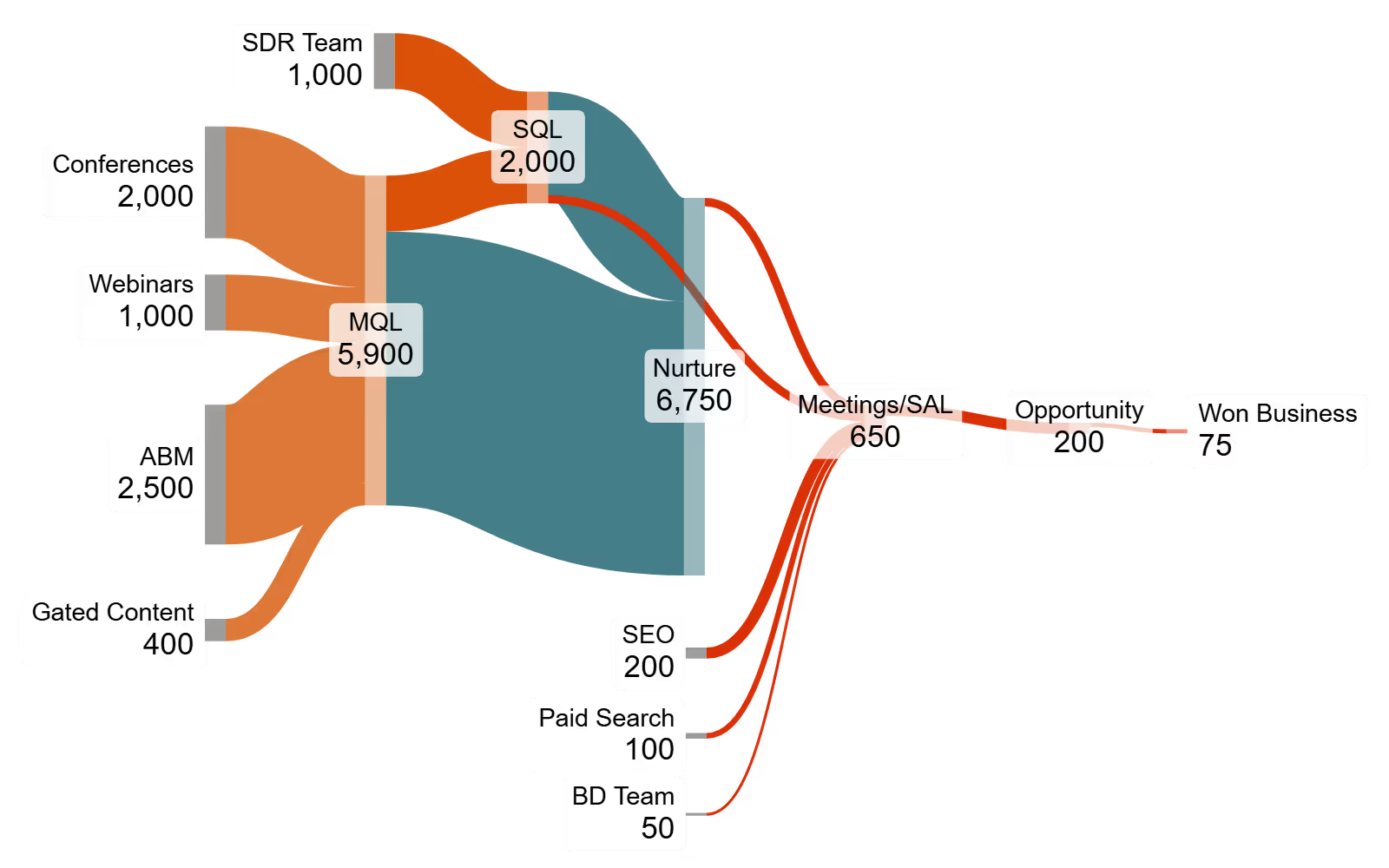
Here is the output Sankey diagram, created in SankeyMATIC.com:
Interpreting the Sankey Diagram
Now that we have created our Sankey using the code above, we can analyze and see what it shows us. By visualizing our lead flows and stages, we can immediately see the importance of the nurture stage, and of continuous nurturing to drive meetings. We can observe that while ABM drives the highest volume of MQLs, a significant portion require nurturing before becoming sales-ready. Conversely, we can validate that SDR-sourced leads have a more direct path to SQL status, and see that search contributes to nearly half of the SALs generated.
Additionally, after the Sankey is created we can adjust the diagram including colors, the location of the nodes, and the flow direction to customize the visualization. For example, we could adjust colors and layout to highlight specific "At-Risk" pathways or "High-Velocity" channels, giving you a report-ready visual of your commercial health.
Using Data Effectively to Guide Your Strategy and Tactics
Data for its own sake has limited usefulness - but if structured and visualized well, it can be an invaluable tool to help guide your work. We’d encourage all marketers to experiment with different ways of visualizing data. Doing so will help you understand your data better, identify data gaps, will provide insight into what your marketing is doing, and make you more conversant in explaining the results.
At Fractorial we can design and run complex, data-driven campaigns for you, and also build the platforms and approaches to enhance your ability to be a data-driven marketing organization. Contact us if you're interested in learning more.
Recent articles

ABM lite: how to start and run an account-based program on a limited budget

Finding in-Market Sponsors: A BD Guide for CROs & CDMOs
A Prescription for Getting Started in Life Science ABM
Ready to Build a Smarter Marketing Engine?
Our work helps teams turn complex data into growth — driving qualified leads, higher engagement, and stronger campaign performance across every channel.